Here is a picture of how they organize their materials.
Tuesday, October 18, 2011
Olsen Kundig Architects
One of the greatest opportunities that I have been given was to job shadow Debbie Kennedy at Olsen Kundig Architects. It was a great experience to be able to see and feel what it's like to be in a big firm with so many talented and gifted group of people.
St. Ignacius
St. Ignacius is a beautiful church in Seattle, WA.
Here is a sketch of the exterior. I love how the pond gives a beautiful reflection onto the building. It adds a beautiful, natural texture/pattern.
The top is a sketch of the lobby and the bottom is a sketch of the main chapel.
The top is a sketch of a wall that pops out with lighting underneath with a beautiful glow. The bottom is a sketch of the stage.
Jim Olsen
Jim Olsen gave a beautiful message about the unification of architecture, art, and nature. He describes the beauty of nature and how much it fascinates him.
What inspired him to be an architect was the cabin he grew up in. One of the metaphors he used was how flowers contrast the background so that the bees can see them. As you can see in the sketch below, the same concept applies. The wood is laid out horizontally as the trees (nature) are the background.
One thing he said about nature that stood out to me was, "The thrill of risking something is to see something beautiful." We never know what there are in the woods, forests, etc. unless we take the chance to go and explore.
Some homes are inspired through art pieces, such as, the Red House. The cool thing about the way he used art in his designs were to frame a piece of nature through the window frames. By doing so, you can feel like your outside while you're inside. His famous quote from this lecture was,
"You can have the best art in the world, but you can never compete with nature."
Jim Olsen is one of the greatest speakers that I have heard about design. He has given me a new perspective of design through the nature of art.
What inspired him to be an architect was the cabin he grew up in. One of the metaphors he used was how flowers contrast the background so that the bees can see them. As you can see in the sketch below, the same concept applies. The wood is laid out horizontally as the trees (nature) are the background.
One thing he said about nature that stood out to me was, "The thrill of risking something is to see something beautiful." We never know what there are in the woods, forests, etc. unless we take the chance to go and explore.
Some homes are inspired through art pieces, such as, the Red House. The cool thing about the way he used art in his designs were to frame a piece of nature through the window frames. By doing so, you can feel like your outside while you're inside. His famous quote from this lecture was,
"You can have the best art in the world, but you can never compete with nature."
Jim Olsen is one of the greatest speakers that I have heard about design. He has given me a new perspective of design through the nature of art.
Wheel Chair
For the wheel chair assignment, I partnered up with Megan Pharmer. By riding a wheelchair ourselves helped us understood what we needed to think about when designing.
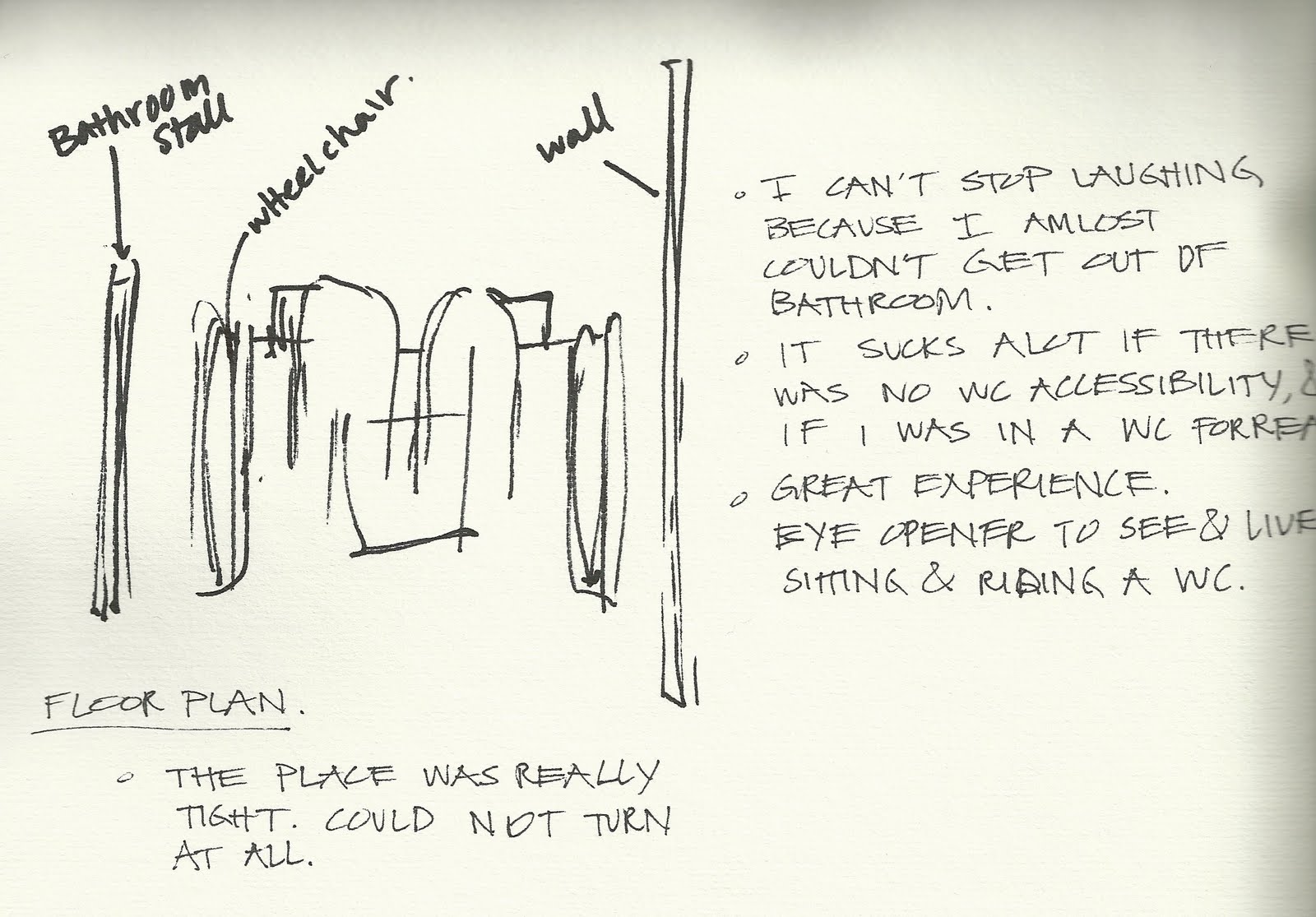
Here is a sketch and some notes that I took from my experience. I couldn't help myself but laugh how terrible it was inside a non-accessible bathroom. I've learned a little glimpse of what life is like to ride a wheel chair but it has really opened my eyes to see how important it is to make sure everywhere is accessible.
Here is Megan trying to turn around to exit the small kitchen in ELB.
Here is Megan trying to find accessible pathways to a building in order to avoid going down a hill.
Here is Megan trying to reach for a library book.
Here is Megan facing sideways at the copy machine. It was hard for her to reach and set the book in the right position.
The bathroom outside of the Architecture library was wheelchair accessible. There were plenty of space for Megan to turn around and allowed her to be able to wash her hands.
After Megan's success, it was my turn to ride the wheel chair to the small cafe in Carpenter Hall.
Here is a picture taken from my view as I sat in the wheel chair.
Here I am at the Pick-up order.
While Megan and I were heading back, we came across a space in the parking lot that would not allow me to pass. It reminded me how important it is to have space in a parking lot for accessibility as well.
This water fountain was not wheel chair accessible.
Here I am, struggling to back up from a bathroom stall that was not accessible.
Here is a sketch and some notes that I took from my experience. I couldn't help myself but laugh how terrible it was inside a non-accessible bathroom. I've learned a little glimpse of what life is like to ride a wheel chair but it has really opened my eyes to see how important it is to make sure everywhere is accessible.
Sunday, October 2, 2011
Habitat for Humanity
Habitat for Humanity is a great place to live in a brand new house, even with a low income. I had the opportunity to be a part of building that specific home. It was an eye opener for me to see what goes on inside the walls, such as, the electric wires, insallations, the structures of the woods, and lots of nails. I helped put the insallation in between the woods in the wall, and helped drilled in nails to the floor to help secure it. I also went around and hammered the nails to flatten it out. I didn't get the chance to take pictures, but from this experience, I have learned that building a home is not easy! It's definitely hard and dirty work, but I am very glad that I had this great experience during the construction work.
Friday, September 23, 2011
Reveal Expo 2011
Reveal Expo 2011 was a great experience for me. I had the opportunity to travel with my two classmates, Megan and Liz. This expo took place at the Lincoln Center in Spokane.
The place was filled with so many different firms, designers, and products. The lighting of the show room was very nice and beautiful.
One of the coolest thing I saw was the Diamond Chair designed by Harry Bertoia at the Knoll booth. It was one of the chairs that I researched in my ID102 bench poster project. I loved it! It is more comfortable than it actually looks, at the same time, very aesthetically pleasing.
These minerals are what makes Nylon. The lady at the booth scribbled on a nylon mat with a permanent marker and got the stains out in an instant with alcolhol. It was really amazing!
I was very grateful to have the chance of sitting in the newest Herman Miller furniture. This furniture was designed toward students because it allows students to study and relax by sitting sideways.
My favorite material item that I saw was this red pattern countertop. The lady showed me a picture of the kitchen that used this specific item as countertops. It was very beautiful! It motivated me to use something like this for my kitchen design project.
There are so much more to share about my experience, but the things I mentioned were definitely the highlights of my trip. As an interior designer student, I have realized how important it is to learn and know about materials. At this point, I have so little knowledge and I will do my best to gain that knowledge!
The place was filled with so many different firms, designers, and products. The lighting of the show room was very nice and beautiful.
One of the coolest thing I saw was the Diamond Chair designed by Harry Bertoia at the Knoll booth. It was one of the chairs that I researched in my ID102 bench poster project. I loved it! It is more comfortable than it actually looks, at the same time, very aesthetically pleasing.
These minerals are what makes Nylon. The lady at the booth scribbled on a nylon mat with a permanent marker and got the stains out in an instant with alcolhol. It was really amazing!
I was very grateful to have the chance of sitting in the newest Herman Miller furniture. This furniture was designed toward students because it allows students to study and relax by sitting sideways.
My favorite material item that I saw was this red pattern countertop. The lady showed me a picture of the kitchen that used this specific item as countertops. It was very beautiful! It motivated me to use something like this for my kitchen design project.
There are so much more to share about my experience, but the things I mentioned were definitely the highlights of my trip. As an interior designer student, I have realized how important it is to learn and know about materials. At this point, I have so little knowledge and I will do my best to gain that knowledge!
Thursday, September 1, 2011
Context Poster - Color
My partner, Megan Pharmer, and I researched on Color. In order to have a successful design we must understand the basic principles of color. It's not just about decorating a home but to create form through color. We need to realize how much color impacts us humans physically and mentally so that we can fulfill the needs of our client.
Two case studies were used as examples of how color works. The voyage home used light hues of blue and green because those colors are more relaxing for a vacation home. On the other hand, the comic book studio used very dark and dramatic colors. The darker the color the more energy it has.
Subscribe to:
Posts (Atom)