
Sunday, February 27, 2011
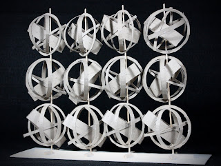
Wall Design
The objectives of the wall project in my ID 102 class was to create a wall using twelve 3in x 3in cubes that consist of five objects with one being the dominant piece. By using circles instead of squares, it was a difficult challenge for me. If I were to change the structure, I would use squares instead of circles. I learned from this project that circles are harder to work with, especially cutting out the pieces and trying to find a way to hold the wall. Although this was very challenging, it was a success.
Wednesday, February 16, 2011
Sketch - Chair
The chair I chose was one of the chairs from our studio. I was curious about why we use these kind to work on projects. The adjustments of the seat height that are available can be helpful and convenient to a person. What I could have done better was to draw the chair more in proportion to match the perspective that I observed from. I think if I were to use a smaller tip sharpie, it would be easier to see and understand the details.


Sketch - Fruits
In order to bring out the shape and forms of the fruits, I used the technique called "Cross-hatching." I also used it to differentiate the relationship between the surface and the wall. This was the first time I tried the cross-hatching technique, so it was challenging for me. It was hard for me to show the different values of shading and to create a 3-Dimensional figure. What may have helped me was if I used smaller and more strokes.


Sketch - Keys
The purpose of this sketch was to draw clean lines with no erasing, and to enlarge the keys to fit the size of the paper. No specific technique was mentioned, therefore, I used the scribbling technique in different directions for the shading. I feel that this sketch was a success and there's nothing that I would change besides centering the keys more.


Monday, February 14, 2011
Textile Pattern
The textile pattern was inspired through my cultural heritage. This design was very plain and simple. It's very straightforward about what the Hmong people value the most. I don't know what else I could of done for this design, but this layout design was the first thing that came to my mind when I thought about my cultural heritage.


Hmong Traditional Clothing
Farming and gardening are the ways of survival for the Hmong people. Each family is required to work in the fields in order to make money and to be able to afford Hmong traditional clothing. Hmong clothes are valuable to the people because they are passed onto the next generation. The fabric and materials are costly, and all designs are made by hand. These considerations are developed into a textile pattern to reflect the Hmong people.
The bright color palette in the textile recalls the Hmong clothes worn for weddings and celebrations. Every outfit has its own colors and theme depending on which clan they are from. The textile pattern creates an interesting eye movement and rhythm all throughout reflecting the traditional Hmong clothing.
Having at least one pair of traditional outfit means a lot to a Hmong person. Therefore, the bright color pink is the focal point in drawing people’s attention of how important Hmong clothes are. The embroidered figures of people shown on the textile pattern are one example of a clan’s shape and form of traditional clothing, and the pattern design in the background is used to direct the movement of the eye in understanding the textile theme.
Geometric Pattern
The Geometric Pattern design was created with six images that were edited and distorted in Adobe Photoshop CS5. I wanted to create a mystery look to it, so I used more cooler colors. I added contrast by using some warm colors. This pattern was challenging because it didn't turn out the way I wanted it to. The layout I designed consisted of a lot of shapes, but not in the kind of order that would create a more aesthetic movement. What I could have done was to distort the pictures more so the picture wouldn't be recognized. I feel like there were too much detail and not enough effects.


Subscribe to:
Posts (Atom)