
Showing posts with label 201FA11. Show all posts
Showing posts with label 201FA11. Show all posts
Friday, December 16, 2011

Meeting with Designer
I had the opportunity to meet with Tina Johansen from ALSC Architects over Thanksgiving break. We met up to go over the floor plan I designed for the Gregory Family. She made notes on which walls to color in black or not; as well as placing taller appliances by each other. Although it was a short meeting, it went great.
Wednesday, November 30, 2011
Gregory Family Bathroom Design: The Present
This bathroom design was inspired by the painting, "Persistence of Memory" by Salvador Dali. I focused on the contrasting colors, lines and circular shapes.
The circular appliances that lie on top of the straight edges in the design derived from the clocks that were found along the straight edges in the painting.

The circular appliances that lie on top of the straight edges in the design derived from the clocks that were found along the straight edges in the painting.

Tuesday, November 29, 2011
Gregory Family Kitchen Design
This kitchen design was inspired by the song, "Home" by Chris Daughtry. He talks about how home is the place where love begins and that no matter where he goes he will always return.
Three key words that I focused on were: Movement, stable and focal point. In my concept model, the black foam core is the focal point; the dowels show movement through gradation; and whichever way you set the concept model down represents stability.
This kitchen allows wheelchair accessibility for the client at the same time providing a space for regular use.
Since this was my first design project there are many things that I would like to change or fix. I would change the color of the walls and cabinets.

Three key words that I focused on were: Movement, stable and focal point. In my concept model, the black foam core is the focal point; the dowels show movement through gradation; and whichever way you set the concept model down represents stability.
This kitchen allows wheelchair accessibility for the client at the same time providing a space for regular use.
Since this was my first design project there are many things that I would like to change or fix. I would change the color of the walls and cabinets.

Sunday, October 23, 2011
WSU A+CM Integrated Education Symposium
This lecture was directed more towards the Construction Management, Architecture and Engineer students, but I was able grasp some interesting information. The main focus was how DESIGN = CONSTRUCTION, vice versa. When you integrate and collaborate together you can create extraordinary results. Interaction is different when there's a higher number of people or lower so they prefer 12 or less for better communication.
One interesting quote that I heard was, "We don't start with a solution, but a goal." By doing so, there's no over cost for the client because they would be able to accomplish that goal.
Another interesting quote was, "Beauty is not something you tack on at the end, but mixing it in." What a genius!
Their construction of buildings are very HONEST! If a part is not needed, it will not be there. Materials are made the way it is already so might as well use it in the construction.
One interesting quote that I heard was, "We don't start with a solution, but a goal." By doing so, there's no over cost for the client because they would be able to accomplish that goal.
Another interesting quote was, "Beauty is not something you tack on at the end, but mixing it in." What a genius!
Their construction of buildings are very HONEST! If a part is not needed, it will not be there. Materials are made the way it is already so might as well use it in the construction.
Tuesday, October 18, 2011
Jim Olsen
Jim Olsen gave a beautiful message about the unification of architecture, art, and nature. He describes the beauty of nature and how much it fascinates him.
What inspired him to be an architect was the cabin he grew up in. One of the metaphors he used was how flowers contrast the background so that the bees can see them. As you can see in the sketch below, the same concept applies. The wood is laid out horizontally as the trees (nature) are the background.

One thing he said about nature that stood out to me was, "The thrill of risking something is to see something beautiful." We never know what there are in the woods, forests, etc. unless we take the chance to go and explore.
Some homes are inspired through art pieces, such as, the Red House. The cool thing about the way he used art in his designs were to frame a piece of nature through the window frames. By doing so, you can feel like your outside while you're inside. His famous quote from this lecture was,
"You can have the best art in the world, but you can never compete with nature."
Jim Olsen is one of the greatest speakers that I have heard about design. He has given me a new perspective of design through the nature of art.
What inspired him to be an architect was the cabin he grew up in. One of the metaphors he used was how flowers contrast the background so that the bees can see them. As you can see in the sketch below, the same concept applies. The wood is laid out horizontally as the trees (nature) are the background.

One thing he said about nature that stood out to me was, "The thrill of risking something is to see something beautiful." We never know what there are in the woods, forests, etc. unless we take the chance to go and explore.
Some homes are inspired through art pieces, such as, the Red House. The cool thing about the way he used art in his designs were to frame a piece of nature through the window frames. By doing so, you can feel like your outside while you're inside. His famous quote from this lecture was,
"You can have the best art in the world, but you can never compete with nature."
Jim Olsen is one of the greatest speakers that I have heard about design. He has given me a new perspective of design through the nature of art.
Wheel Chair
For the wheel chair assignment, I partnered up with Megan Pharmer. By riding a wheelchair ourselves helped us understood what we needed to think about when designing.


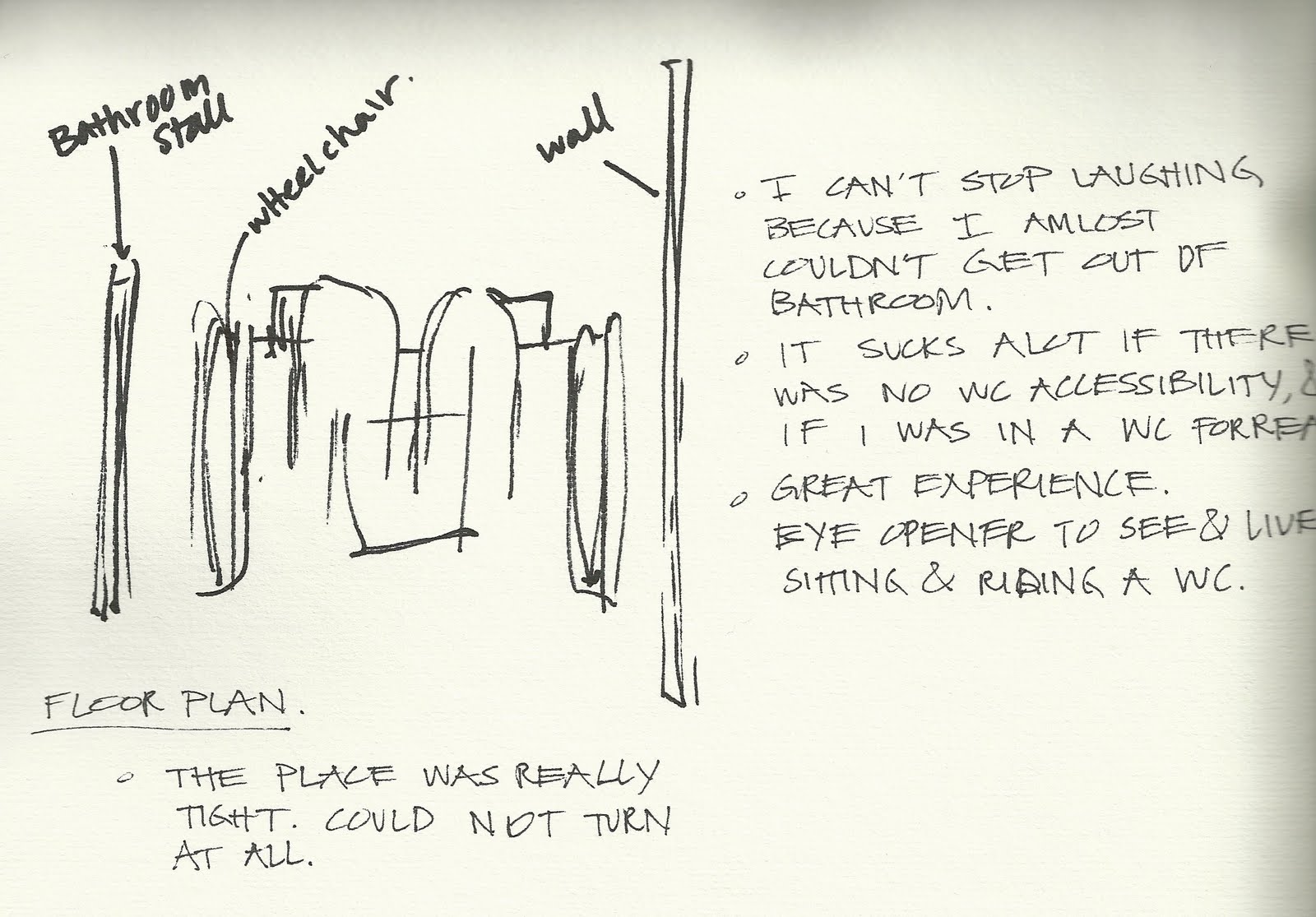
Here is a sketch and some notes that I took from my experience. I couldn't help myself but laugh how terrible it was inside a non-accessible bathroom. I've learned a little glimpse of what life is like to ride a wheel chair but it has really opened my eyes to see how important it is to make sure everywhere is accessible.

Here is Megan trying to turn around to exit the small kitchen in ELB.

Here is Megan trying to find accessible pathways to a building in order to avoid going down a hill.

Here is Megan trying to reach for a library book.

Here is Megan facing sideways at the copy machine. It was hard for her to reach and set the book in the right position.

The bathroom outside of the Architecture library was wheelchair accessible. There were plenty of space for Megan to turn around and allowed her to be able to wash her hands.

After Megan's success, it was my turn to ride the wheel chair to the small cafe in Carpenter Hall.

Here is a picture taken from my view as I sat in the wheel chair.

Here I am at the Pick-up order.

While Megan and I were heading back, we came across a space in the parking lot that would not allow me to pass. It reminded me how important it is to have space in a parking lot for accessibility as well.

This water fountain was not wheel chair accessible.

Here I am, struggling to back up from a bathroom stall that was not accessible.

Here is a sketch and some notes that I took from my experience. I couldn't help myself but laugh how terrible it was inside a non-accessible bathroom. I've learned a little glimpse of what life is like to ride a wheel chair but it has really opened my eyes to see how important it is to make sure everywhere is accessible.
Thursday, September 1, 2011
Context Poster - Color
My partner, Megan Pharmer, and I researched on Color. In order to have a successful design we must understand the basic principles of color. It's not just about decorating a home but to create form through color. We need to realize how much color impacts us humans physically and mentally so that we can fulfill the needs of our client.
Two case studies were used as examples of how color works. The voyage home used light hues of blue and green because those colors are more relaxing for a vacation home. On the other hand, the comic book studio used very dark and dramatic colors. The darker the color the more energy it has.

Two case studies were used as examples of how color works. The voyage home used light hues of blue and green because those colors are more relaxing for a vacation home. On the other hand, the comic book studio used very dark and dramatic colors. The darker the color the more energy it has.

Subscribe to:
Posts (Atom)