
Friday, December 16, 2011
Meeting with Designer
I had the opportunity to meet with Tina Johansen from ALSC Architects over Thanksgiving break. We met up to go over the floor plan I designed for the Gregory Family. She made notes on which walls to color in black or not; as well as placing taller appliances by each other. Although it was a short meeting, it went great.
Wednesday, November 30, 2011
Gregory Family Bathroom Design: The Present
This bathroom design was inspired by the painting, "Persistence of Memory" by Salvador Dali. I focused on the contrasting colors, lines and circular shapes.
The circular appliances that lie on top of the straight edges in the design derived from the clocks that were found along the straight edges in the painting.

The circular appliances that lie on top of the straight edges in the design derived from the clocks that were found along the straight edges in the painting.

Tuesday, November 29, 2011
Gregory Family Kitchen Design
This kitchen design was inspired by the song, "Home" by Chris Daughtry. He talks about how home is the place where love begins and that no matter where he goes he will always return.
Three key words that I focused on were: Movement, stable and focal point. In my concept model, the black foam core is the focal point; the dowels show movement through gradation; and whichever way you set the concept model down represents stability.
This kitchen allows wheelchair accessibility for the client at the same time providing a space for regular use.
Since this was my first design project there are many things that I would like to change or fix. I would change the color of the walls and cabinets.

Sunday, October 23, 2011
WSU A+CM Integrated Education Symposium
This lecture was directed more towards the Construction Management, Architecture and Engineer students, but I was able grasp some interesting information. The main focus was how DESIGN = CONSTRUCTION, vice versa. When you integrate and collaborate together you can create extraordinary results. Interaction is different when there's a higher number of people or lower so they prefer 12 or less for better communication.
One interesting quote that I heard was, "We don't start with a solution, but a goal." By doing so, there's no over cost for the client because they would be able to accomplish that goal.
Another interesting quote was, "Beauty is not something you tack on at the end, but mixing it in." What a genius!
Their construction of buildings are very HONEST! If a part is not needed, it will not be there. Materials are made the way it is already so might as well use it in the construction.
Tuesday, October 18, 2011
Olsen Kundig Architects
One of the greatest opportunities that I have been given was to job shadow Debbie Kennedy at Olsen Kundig Architects. It was a great experience to be able to see and feel what it's like to be in a big firm with so many talented and gifted group of people.

Here is a picture of how they organize their materials.

St. Ignacius
St. Ignacius is a beautiful church in Seattle, WA.


Here is a sketch of the exterior. I love how the pond gives a beautiful reflection onto the building. It adds a beautiful, natural texture/pattern.

The top is a sketch of the lobby and the bottom is a sketch of the main chapel.

The top is a sketch of a wall that pops out with lighting underneath with a beautiful glow. The bottom is a sketch of the stage.

Jim Olsen
Jim Olsen gave a beautiful message about the unification of architecture, art, and nature. He describes the beauty of nature and how much it fascinates him.
What inspired him to be an architect was the cabin he grew up in. One of the metaphors he used was how flowers contrast the background so that the bees can see them. As you can see in the sketch below, the same concept applies. The wood is laid out horizontally as the trees (nature) are the background.

One thing he said about nature that stood out to me was, "The thrill of risking something is to see something beautiful." We never know what there are in the woods, forests, etc. unless we take the chance to go and explore.
Some homes are inspired through art pieces, such as, the Red House. The cool thing about the way he used art in his designs were to frame a piece of nature through the window frames. By doing so, you can feel like your outside while you're inside. His famous quote from this lecture was,
"You can have the best art in the world, but you can never compete with nature."
Jim Olsen is one of the greatest speakers that I have heard about design. He has given me a new perspective of design through the nature of art.
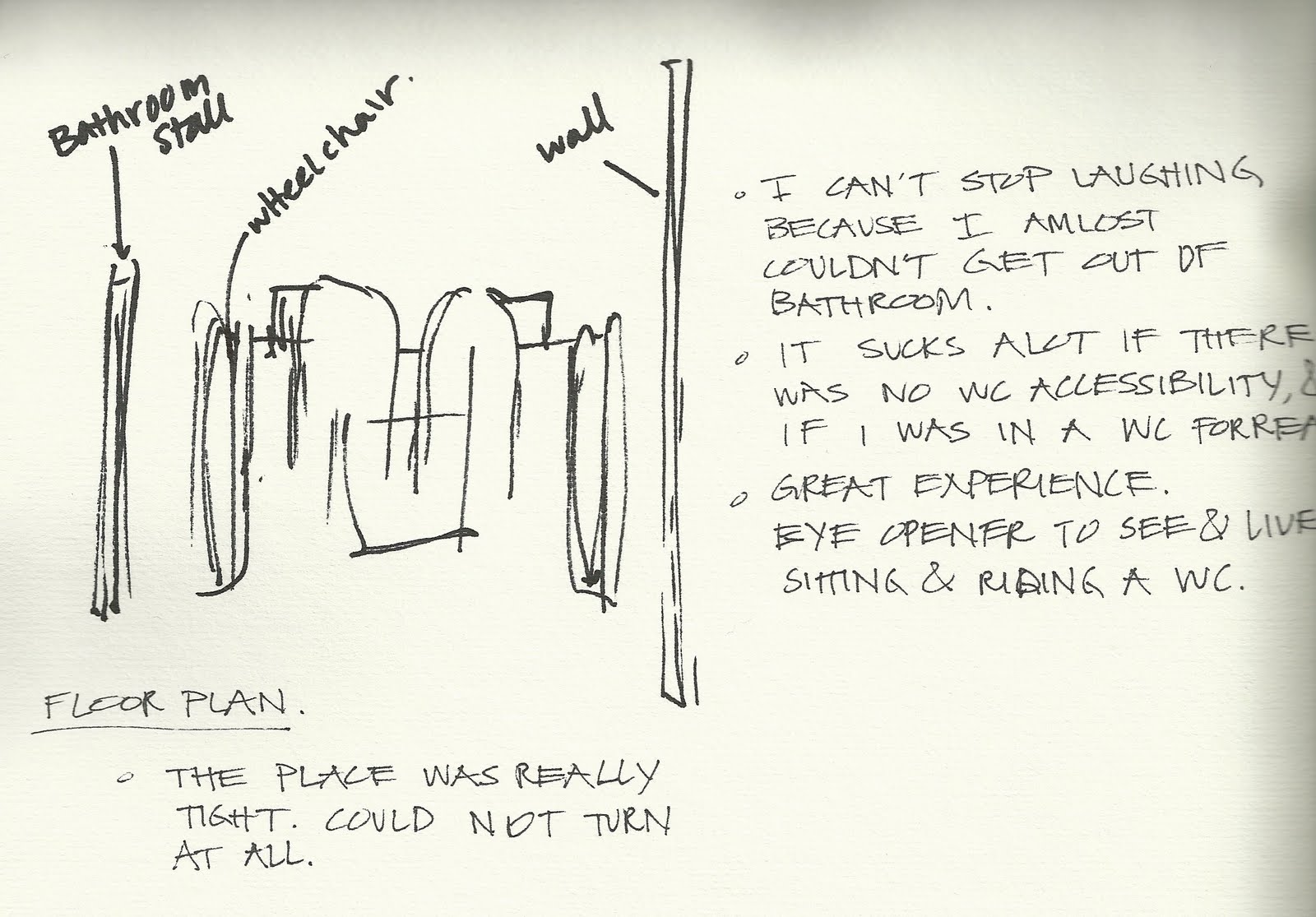
Wheel Chair
For the wheel chair assignment, I partnered up with Megan Pharmer. By riding a wheelchair ourselves helped us understood what we needed to think about when designing.


Here is a sketch and some notes that I took from my experience. I couldn't help myself but laugh how terrible it was inside a non-accessible bathroom. I've learned a little glimpse of what life is like to ride a wheel chair but it has really opened my eyes to see how important it is to make sure everywhere is accessible.

Here is Megan trying to turn around to exit the small kitchen in ELB.

Here is Megan trying to find accessible pathways to a building in order to avoid going down a hill.

Here is Megan trying to reach for a library book.

Here is Megan facing sideways at the copy machine. It was hard for her to reach and set the book in the right position.

The bathroom outside of the Architecture library was wheelchair accessible. There were plenty of space for Megan to turn around and allowed her to be able to wash her hands.

After Megan's success, it was my turn to ride the wheel chair to the small cafe in Carpenter Hall.

Here is a picture taken from my view as I sat in the wheel chair.

Here I am at the Pick-up order.

While Megan and I were heading back, we came across a space in the parking lot that would not allow me to pass. It reminded me how important it is to have space in a parking lot for accessibility as well.

This water fountain was not wheel chair accessible.

Here I am, struggling to back up from a bathroom stall that was not accessible.

Here is a sketch and some notes that I took from my experience. I couldn't help myself but laugh how terrible it was inside a non-accessible bathroom. I've learned a little glimpse of what life is like to ride a wheel chair but it has really opened my eyes to see how important it is to make sure everywhere is accessible.
Sunday, October 2, 2011
Habitat for Humanity
Habitat for Humanity is a great place to live in a brand new house, even with a low income. I had the opportunity to be a part of building that specific home. It was an eye opener for me to see what goes on inside the walls, such as, the electric wires, insallations, the structures of the woods, and lots of nails. I helped put the insallation in between the woods in the wall, and helped drilled in nails to the floor to help secure it. I also went around and hammered the nails to flatten it out. I didn't get the chance to take pictures, but from this experience, I have learned that building a home is not easy! It's definitely hard and dirty work, but I am very glad that I had this great experience during the construction work.
Friday, September 23, 2011
Reveal Expo 2011
Reveal Expo 2011 was a great experience for me. I had the opportunity to travel with my two classmates, Megan and Liz. This expo took place at the Lincoln Center in Spokane.

The place was filled with so many different firms, designers, and products. The lighting of the show room was very nice and beautiful.

One of the coolest thing I saw was the Diamond Chair designed by Harry Bertoia at the Knoll booth. It was one of the chairs that I researched in my ID102 bench poster project. I loved it! It is more comfortable than it actually looks, at the same time, very aesthetically pleasing.

These minerals are what makes Nylon. The lady at the booth scribbled on a nylon mat with a permanent marker and got the stains out in an instant with alcolhol. It was really amazing!

I was very grateful to have the chance of sitting in the newest Herman Miller furniture. This furniture was designed toward students because it allows students to study and relax by sitting sideways.

My favorite material item that I saw was this red pattern countertop. The lady showed me a picture of the kitchen that used this specific item as countertops. It was very beautiful! It motivated me to use something like this for my kitchen design project.

There are so much more to share about my experience, but the things I mentioned were definitely the highlights of my trip. As an interior designer student, I have realized how important it is to learn and know about materials. At this point, I have so little knowledge and I will do my best to gain that knowledge!
Thursday, September 1, 2011
Context Poster - Color
My partner, Megan Pharmer, and I researched on Color. In order to have a successful design we must understand the basic principles of color. It's not just about decorating a home but to create form through color. We need to realize how much color impacts us humans physically and mentally so that we can fulfill the needs of our client.
Two case studies were used as examples of how color works. The voyage home used light hues of blue and green because those colors are more relaxing for a vacation home. On the other hand, the comic book studio used very dark and dramatic colors. The darker the color the more energy it has.

Two case studies were used as examples of how color works. The voyage home used light hues of blue and green because those colors are more relaxing for a vacation home. On the other hand, the comic book studio used very dark and dramatic colors. The darker the color the more energy it has.

Friday, April 29, 2011
Iris Bench Poster
The Iris Bench design was inspired by a long metal piece that consisted of many elements and principles, which led to my concept model design. Everything that was built had to relate back to the elements and principles, so it took me many explorations of benches to get to my final design.
During the whole process, I realized how challenging it was to design any type of bench or chair. I never knew how important ADA requirements are until building my own bench. I think that I've grown so much from this project because I had to find the solutions and answers to my own questions and issues. I believe that I now have a better understanding of how the elements and principles work, and how they are applied.
Designing the layout of this poster was also a challenge for me. I've learned the importance of alignment because it is what makes a poster professional. Although posters look like they're pretty easy to design, it's actually not. It uses a lot of thinking and processing, which I now feel that I understand it more. Not only that, but the writing descriptions is also were very challenging because you can't use "me, I, or myself." Overall, this whole Bench project has definitely changed my way of thinking and perspective on design.

Sketch Book - Front & Back Cover & Reflection
I started with my Reflection, which led me to the theme of spring and flowers for my front and back cover. The colors are beautiful and they remind me of the blooming flower season. I like the looks of cursive writing, which fits perfectly with the girly look. Not only that, but I also drew these sketches during my Spring 2011 semester.
Writing the reflection really made me realize how far I've come. My drawing skills have definitely improved, and I feel that I am not the same anymore when it comes to art. My critical thinking about concepts and details are stronger now, and I want to continue to further my understanding.
Front Cover

Back Cover

My Reflection

Sketch - Outside Macro Sketch
The purpose of this sketch was to draw 4 vignettes of different objects close-up and turn each object into a work of art. I chose to sketch a pinecone, a plant, mushrooms, and a rock. I feel that this sketch was successful, and there would be nothing that I would change. I focused more on the layout of my 3x3 boxes because I believe that it is what makes this drawing stand out.


Tuesday, April 26, 2011
Sketch - Building Construction
This sketch was something of your choice that must be real. I chose my drawer in the studio. I used a lot of contrast to show the shape and form of the object, but by using only one color was quite challenging. I think that this sketch is successful because I was able to show the form through the light and dark areas.


Sketch - Kitchen Still-Life
The purpose of this sketch was to create a still-life on a table using kitchen/eating items and an unexpected item, considering the different textures, value changes, and volume of each. Sketching a still-life have always been a challenge for me because it is difficult to make sure everything is in perspective. I started building the still-life with a cupcake, then I added the wine glass and chopsticks. For the unexpected item, I chose a pair of pearl earrings to represent a girl. Since the chopsticks is very Asian and the wine glass is very American, I decided to capture the mood of the drawing as "Cute Asian American Girl." What I found quite interesting were the textures because I had to figure out how to color and shade each object to make it look like it's the right texture. I feel that this sketch was a success, but what I would do to make it better would be to try to draw it from one perspective.


Thursday, April 21, 2011
Sketch - Value Study in Line
The purpose of this sketch was to draw two sketches of the same place on the same sheet of paper, but different ways of showing line weights and contrast. The place of the building needs to show a window wall, back wall, floor, and ceiling. I chose to draw our studio room. The top sketch shows the value of the space by using line weights, and the bottom sketch shows the value by using high contrast as the shadow. I think that I wouldn't change anything because it has fulfilled the purpose.


Sketch - Erased Negative Space
The purpose of this sketch was to use only shading and erasing of any object that has interesting voids. I shaded the background and then erased the graphite to show the frame of the flowers. This sketch was pretty difficult because it was not easy to erase the graphite off. Therefore, it doesn't have a clean look to the drawing. What I would do to fix this is to erase the graphite more to show the figure clearly.


Sketch - Still Life Cross-Section
The purpose of this sketch was to slice a fruit or vegetable that has an interesting interior and place it with two other fruits or vegetables as a still life. I chose to use bell peppers and a lemon. I used the scribbling technique, which I think was successful to show the details of the vegetable's shape and figure.


Sketch - Napkin
This sketch was drawn on a 5x8 white napkin of the floorplan and elevation of where you live. I drew the floorplan of my apartment and my kitchen as the elevation. I also annotated the drawing to indicate which part was which. It actually took me a few tries to make this drawing turn out right because if you don't press gently, the napkin will rip. I thought that this sketch idea was pretty creative because if there wasn't a paper anywhere and you have an idea, it's great to use whatever that is in front of you.


Wednesday, April 20, 2011
Resume
This was my first time putting a resume together. It was a great learning experience for me, eventhough I didn't have much to fill in. I never knew how important a resume was until now. I actually had some difficulties trying to find a good layout for it to look professional, so I went with a clean and simple look. By mixing big and small fonts, it gives a more creative and interesting feel to the reader.
During the process, I realized that I need to get myself more involved with jobs and activities. It is important to gain as much experiences as I can to understand what's out there in the world. I'm glad I was given the opportunity to write up my own resume because now it's easier for me to find a job without worrying how to write one.

During the process, I realized that I need to get myself more involved with jobs and activities. It is important to gain as much experiences as I can to understand what's out there in the world. I'm glad I was given the opportunity to write up my own resume because now it's easier for me to find a job without worrying how to write one.

Monday, April 18, 2011
Sketch - Chair Negative Space
I selected a chair from a magazine that had an open back to the seat, in order to show the shape of the chair in a negative form. As you see, the negative space is shaded in and it outlines the chair. What I would have done differently was to challenge myself by sketching the chair at the same time while shading because what I did was that I sketched the shape of the chair first and then shaded around the chair second.


Sketch - Black Paper
The objective of this sketch was to create an illusion through the use of colors and a sketching technique of an architectural element on a black sheet of paper. I chose to draw a hinge on a closet. It was a bit confusing and challenging at first because I didn't know how to create an illusion by using so many different colors that are nothing like the original piece, but I figured it out my second time. I'm actually satisfied with this sketch because I feel that I fulfilled the purpose of this assignment.


Sketch - Figure Tracing from Photograph
We had the opportunity to choose a random picture with a person sitting, running, standing, or walking. I chose one of my favorite celebrities and traced the her figure position. What I could have made this better was to use different size ink pens so it would differentiate the parts of her body so it would be easier to understand.


Sketch - Figure Tracing
The purpose of this sketch was to trace two figure drawings and then freehand the rest to fill up the page. This was my first time drawing anthropometrics, which I thought was a great experience as an introduction to these type of figures. These figures were also quite a challenge for me because I couldn't draw them in proportion. I need to practice more so I can sketch these faster and look neat at the same time.


Monday, April 11, 2011
Sketch - Room Corner
The objective of this drawing was to sketch an interesting corner from an angle that does not show too much ceiling or too much floor. The technique I chose to use was cross hatching. The closer lines show the darker areas and it also adds shadow and contrast. What I could fix about this sketch would be to use thinner lines and add more lines. I think it would look much better and more professional.


Logo
I used the initials of my first and last name for my logo design. The kind of style that I like is very dynamic, therefore, I tried to show the dynamic style by shaping the letters into a very different shape and form. I also added a scribbly line in the color green because my name also means green. By making the opacity of the scribbly line lighter, my initials stand out. It also works very well in grayscale.
What I have learned from this project of logo designing was that it's important to make sure the design still looks good in grayscale. Since I kept that in mind, I felt like I was really cautious and afraid to use a lot of details and colors. It'll probably take me lots of practice in order to come up with a design that will satisfy me.
Drawing and sketching on the Wacom tablet was a great experience for me. I will need to work with it more to get use to it. When that happens, I believe that whatever design I want to do, it will turn out the way I want it to be.
Wednesday, March 23, 2011
Sketch - Mind Map
The purpose of this sketch was to think of a word that interests you in the design field and center it in the middle of the paper. Then, you were to connect the word to whatever comes to your mind and continue for about 15 minutes. I chose the word 'beauty' because it is what I see when I think about design. I think that this is a great way to express my mind, thoughts, and feelings. What I would change about this sketch is the layout that I chose. I didn't see the other examples on Angel besides the first one, and I think that the other examples are more aesthetically pleasing to me.


Sunday, February 27, 2011
Wall Design
The objectives of the wall project in my ID 102 class was to create a wall using twelve 3in x 3in cubes that consist of five objects with one being the dominant piece. By using circles instead of squares, it was a difficult challenge for me. If I were to change the structure, I would use squares instead of circles. I learned from this project that circles are harder to work with, especially cutting out the pieces and trying to find a way to hold the wall. Although this was very challenging, it was a success.


Wednesday, February 16, 2011
Sketch - Chair
The chair I chose was one of the chairs from our studio. I was curious about why we use these kind to work on projects. The adjustments of the seat height that are available can be helpful and convenient to a person. What I could have done better was to draw the chair more in proportion to match the perspective that I observed from. I think if I were to use a smaller tip sharpie, it would be easier to see and understand the details.


Sketch - Fruits
In order to bring out the shape and forms of the fruits, I used the technique called "Cross-hatching." I also used it to differentiate the relationship between the surface and the wall. This was the first time I tried the cross-hatching technique, so it was challenging for me. It was hard for me to show the different values of shading and to create a 3-Dimensional figure. What may have helped me was if I used smaller and more strokes.


Sketch - Keys
The purpose of this sketch was to draw clean lines with no erasing, and to enlarge the keys to fit the size of the paper. No specific technique was mentioned, therefore, I used the scribbling technique in different directions for the shading. I feel that this sketch was a success and there's nothing that I would change besides centering the keys more.


Subscribe to:
Posts (Atom)