Showing posts with label Designs. Show all posts

Wednesday, May 1, 2013

Little White Schoolhouse

The Little White Schoolhouse is located in Valley, WA. The Valley community wanted to turn this Schoolhouse into a historical museum. To bring a sense of togetherness within the two communities and the historical essence of the Valley, as well as attracting tourist attention, Tamara Upton,  Emily Van Dyke and I came up with the theme, "Uniting the past and future." In order to bring different generations together, we focused on making the space rustic and modern.
 
I researched a case study on the Scottish Rite Masonic Museum & Library Inc. in Lexington, MA. This research was intended to help me understand more about what a heritage museum is all about.


Here are the final posters of The Little White Schoolhouse design.
(Posters by: Nkojoua)


Here are the perspectives I designed through SketchUp, Kerkythea, & Photoshop.  

 
Reception area

Industries Exhibit
 
Memories of Valley in motion & Family History

Lower Level Entrance

Mock Up of a kitchen in 1900's
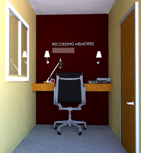
Room for recording and listening to stories
 

This project was a great learning experience. My classmates and I had the opportunity to visit Valley, WA to meet the Valley community. We had a discussion about what they valued and wanted for the Schoolhouse. What I've learned from this real life experience was seeing how much the Little White Schoolhouse means to them regardless of the small size of their town.

I feel that our design was successful because we kept the historical essence and structure of the building. We added a some walls and lighting fixtures to give it a more modern look and feel, at the same time focusing on the history.

Wednesday, February 20, 2013

Webster Hall

The Webster Hall on WSU campus, Pullman, WA has an exhibit that no one hardly stops to take a look at it. My team and I wanted to improve and enhance the experience of the exhibit for everyone. Our focus was to engage the visitors through interactive and hands on activities, along with adding colors and fun fonts to attract attention.
 
PHASE ONE: My team observed the circulation paths by the students, staffs and visitors in Webster Hall. We found out that many people just go in and out of the building without stopping to take a look at the museum.  
 
FLOOR PLAN: We moved a few of the existing interactive and plants around. Benches were added to allow more seating for visitors.
 
CASE MOCK UPS: We researched information about the Big Bang, the Rock Cycle, the Water Cycle, Land and Sea, Environmental Hazards, Palouse Geology, and the WSU Specialties. We measured the cases in Webster Hall and designed posters to cover each case. While my team members did the research, I designed the mock up posters. The fun fonts and colors create a fun learning environment.
 

Posters by: Emily Van Dyke
 
PHASE TWO: We recreated labels for the existing physics interactive by reducing the instructions and changing the color and graphics to the same style as the case mock ups. We also added more engagement activities.
 

Poster By: Emily Van Dyke
 
This project was a challenge for working with a big team of nine people. I feel that we did a great job as a team because everything turned out well.
 
Mock Ups by: Nkojoua Yang
 
Here is a preview of the case mock ups I designed. Each poster was 4'x7'. I learned a lot about graphic designing in this project. One of the most important things I learned was to divide up writing portions into columns so that the reader could read easily without getting lost. The images  and information were given to me by my team members so some of the graphics are not that clear. The most challenging part during the process of putting the posters together were the negative space. I couldn't fill up most of the page because it would be too hard to read if the font sizes were too big and the graphics would become blurry. Overall, this project was a success.


Case Studies

 
The objective of this project was to research three case studies of informal learning environments. These case studies had to include informal learning typology, organizational philosophy, educational intent, graphic identity and marketing, interpretive graphics, topical intent, interactive and children/family-focus.
 
For the three posters of the museums, I identified who, what, where, why and when. The fourth poster focused on researching the effect of color on users, personality typologies and ergonomics.
 
The layouts are organized to help make it easy to read and understand. I used a similar layout and design to create unity for all the posters.
 
I am satisfied with the layout organization and fonts that I chose and feel that I have completed this small project successfully. 


Tuesday, February 19, 2013

Audian Theater

The Audian Theater project was an adaptive reuse team project with two of my classmates, Lue Huang and Marit Pinkoske. The objective was to turn an old theater in Pullman, WA into a bar and study area. Our client also wanted to use this space for socializing and entertainment.

We first researched about what a "third place" was by going out to Cafe Moro to observe the behaviors of the customers and users. We organized the floor plan by figuring out the kitchen first. Then we moved on to planning the bar and seating areas. A second floor was added to create more seating areas. To represent the Cougar nation, we used the colors crimson and gray.

 
 Posters by: Nkojoua Yang

Secret Garden

An existing site relic of concrete and columns were given to build a new construction off of. This home was designed for a cookbook writer as a retreat for the client to engage in his/her passion. There are plants outside on the porch to allow easy access for gathering ingredients. The light moment is also integrated into the entry hallway creating a warm and welcoming space. Massive glass windows expose the interiors to daylight and nature for inspiration.


What I would change about this project is the outdoor area. I would add a roof over the porch and design a garden for the cookbook writer.

Designing for Disaster Relief: Tajikistan

The objective of this project was to choose a location and a natural disaster that took place in that area. My partner, Megan Pharmer and I chose one of the poorer countries in Central Asia called Tajikistan. The climate changes easily from hot to cold so avalanches are most likely to occur and destroy homes.

The solution to provide temporary homes was Super Adobe homes designed by Architect Nadar Khalili. This home is cheap and affordable because the only materials needed are barbed wire and sand bags; the sand bags would be filled with local land.


"To heal what nature has done is nature itself." - Nkojoua & Megan

This video was also submitted for the Designing for Disaster Relief Competition.

Friday, December 16, 2011

Expression

This project was designed for the Gregory family in the Combine building of Pullman, WA.

Wednesday, November 30, 2011

Gregory Family Bathroom Design: The Present

This bathroom design was inspired by the painting, "Persistence of Memory" by Salvador Dali. I focused on the contrasting colors, lines and circular shapes.

The circular appliances that lie on top of the straight edges in the design derived from the clocks that were found along the straight edges in the painting.

Tuesday, November 29, 2011

Gregory Family Kitchen Design

This kitchen design was inspired by the song, "Home" by Chris Daughtry. He talks about how home is the place where love begins and that no matter where he goes he will always return.

Three key words that I focused on were: Movement, stable and focal point. In my concept model, the black foam core is the focal point; the dowels show movement through gradation; and whichever way you set the concept model down represents stability.

This kitchen allows wheelchair accessibility for the client at the same time providing a space for regular use.

Since this was my first design project there are many things that I would like to change or fix. I would change the color of the walls and cabinets.

Thursday, September 1, 2011

Context Poster - Color

My partner, Megan Pharmer, and I researched on Color. In order to have a successful design we must understand the basic principles of color. It's not just about decorating a home but to create form through color. We need to realize how much color impacts us humans physically and mentally so that we can fulfill the needs of our client.

Two case studies were used as examples of how color works. The voyage home used light hues of blue and green because those colors are more relaxing for a vacation home. On the other hand, the comic book studio used very dark and dramatic colors. The darker the color the more energy it has.

Friday, April 29, 2011

Iris Bench Poster

The Iris Bench design was inspired by a long metal piece that consisted of many elements and principles, which led to my concept model design. Everything that was built had to relate back to the elements and principles, so it took me many explorations of benches to get to my final design.

During the whole process, I realized how challenging it was to design any type of bench or chair. I never knew how important ADA requirements are until building my own bench. I think that I've grown so much from this project because I had to find the solutions and answers to my own questions and issues. I believe that I now have a better understanding of how the elements and principles work, and how they are applied.

Designing the layout of this poster was also a challenge for me. I've learned the importance of alignment because it is what makes a poster professional. Although posters look like they're pretty easy to design, it's actually not. It uses a lot of thinking and processing, which I now feel that I understand it more. Not only that, but the writing descriptions is also were very challenging because you can't use "me, I, or myself." Overall, this whole Bench project has definitely changed my way of thinking and perspective on design.

Monday, April 11, 2011

Logo

I used the initials of my first and last name for my logo design. The kind of style that I like is very dynamic, therefore, I tried to show the dynamic style by shaping the letters into a very different shape and form. I also added a scribbly line in the color green because my name also means green. By making the opacity of the scribbly line lighter, my initials stand out. It also works very well in grayscale.

What I have learned from this project of logo designing was that it's important to make sure the design still looks good in grayscale. Since I kept that in mind, I felt like I was really cautious and afraid to use a lot of details and colors. It'll probably take me lots of practice in order to come up with a design that will satisfy me.

Drawing and sketching on the Wacom tablet was a great experience for me. I will need to work with it more to get use to it. When that happens, I believe that whatever design I want to do, it will turn out the way I want it to be.