Showing posts with label Universal Design. Show all posts

Wednesday, May 1, 2013

Little White Schoolhouse

The Little White Schoolhouse is located in Valley, WA. The Valley community wanted to turn this Schoolhouse into a historical museum. To bring a sense of togetherness within the two communities and the historical essence of the Valley, as well as attracting tourist attention, Tamara Upton,  Emily Van Dyke and I came up with the theme, "Uniting the past and future." In order to bring different generations together, we focused on making the space rustic and modern.
 
I researched a case study on the Scottish Rite Masonic Museum & Library Inc. in Lexington, MA. This research was intended to help me understand more about what a heritage museum is all about.


Here are the final posters of The Little White Schoolhouse design.
(Posters by: Nkojoua)


Here are the perspectives I designed through SketchUp, Kerkythea, & Photoshop.  

 
Reception area

Industries Exhibit
 
Memories of Valley in motion & Family History

Lower Level Entrance

Mock Up of a kitchen in 1900's
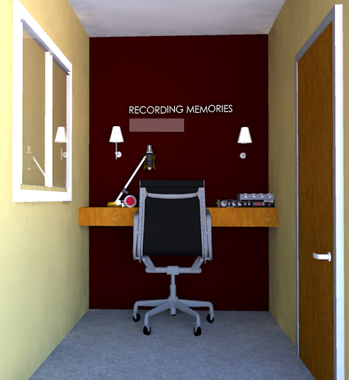
Room for recording and listening to stories
 

This project was a great learning experience. My classmates and I had the opportunity to visit Valley, WA to meet the Valley community. We had a discussion about what they valued and wanted for the Schoolhouse. What I've learned from this real life experience was seeing how much the Little White Schoolhouse means to them regardless of the small size of their town.

I feel that our design was successful because we kept the historical essence and structure of the building. We added a some walls and lighting fixtures to give it a more modern look and feel, at the same time focusing on the history.

Tuesday, May 1, 2012

Depot Design - Natural Movement

The Northern Pacific Railroad Depot in Pullman, WA. was an adaptive reuse project that was designed for Tom Degroot, who is a painter from Seattle, WA., and his wife, who is legally blind. The residential space needed to be <800SF that allowed universal design and accessibility.

The inspiration of the design was a flagpole holder that was attached to one of the windows at the historic depot. Degroot's philosophy statement was combined with the elements of the inspiration. The luminous, silkiness and richness of his paintings were applied to the design through the lighting and color on the walls; his abstract compositions of color and naturalistic patterns were applied to the organic and asymmetrical movement.

Depot Study Models

Before building the final model of the Depot, we had to make three study models, as shown below. These study models were very rough drafts because of the materials we used. We used trace paper and card stock paper that were easy to cut. Using these materials were so rough that it was quite hard to actually see how the space would work, but at the same time, it helped us visualize what we were working with. During this process, it helped me choose what worked for me and what didn't, such as, knowing where to place the residential, studio, and gallery. The small windows were hard to cut out, even on card stock paper. Trying to make it perfect and not cut more that what was needed was a challenge. I was aware of this and did a careful job with the museum board for the final model.


The final Depot model is shown below. Using museum board was stronger and easier to make everything stand up. Even though museum boards can easily get dirty, I made sure that my hands were clean through out the process. I used the hot glue gun because it was stronger and helped hold everything in place. My goals for this model were to end up with the clean model and clean cut lines. I used a ruler while I cut out every piece to make sure everything was straight. Also, I measured everything carefully before I glued everything together. I think that my depot model was successful because I was able to achieve my goals.

The only part that I would try to do better is the exterior landscape design that I drew. I could have worked more with the shape of the sidewalks and give it a better shape.


Thursday, March 1, 2012

Vision Disability Activity

My classmates and I had the opportunity to experience how it feels like to move through space as if we had poor vision. We tried different methods of looking through plastics that contained a specific disability in the eye.

Here is my partner, Megan Pharmer, looking through different plastics.


Looking through a ziploc bag that's folded in half was impossible for me to read the newspaper.


The next task was to fold the ziploc bag into fourths.


We were given a sunglass that was covered with petroleum jelly. When you can't really see, you do rely on texture to find your way around!


The stairs in the Atrium library had good contrast and texture for the blind.


The stairs in the main part of the CUB was not well-designed for the blind. Walking down was difficult because the colors were both very dark.


One thing that I never realized was that blind people uses the ATM as well! 


Here is a sketch that I drew and took notes while I was at the ATM machine.