Reveal Expo 2011 was a great experience for me. I had the opportunity to travel with my two classmates, Megan and Liz. This expo took place at the Lincoln Center in Spokane.
The place was filled with so many different firms, designers, and products. The lighting of the show room was very nice and beautiful.
One of the coolest thing I saw was the Diamond Chair designed by Harry Bertoia at the Knoll booth. It was one of the chairs that I researched in my ID102 bench poster project. I loved it! It is more comfortable than it actually looks, at the same time, very aesthetically pleasing.
These minerals are what makes Nylon. The lady at the booth scribbled on a nylon mat with a permanent marker and got the stains out in an instant with alcolhol. It was really amazing!
I was very grateful to have the chance of sitting in the newest Herman Miller furniture. This furniture was designed toward students because it allows students to study and relax by sitting sideways.
My favorite material item that I saw was this red pattern countertop. The lady showed me a picture of the kitchen that used this specific item as countertops. It was very beautiful! It motivated me to use something like this for my kitchen design project.
There are so much more to share about my experience, but the things I mentioned were definitely the highlights of my trip. As an interior designer student, I have realized how important it is to learn and know about materials. At this point, I have so little knowledge and I will do my best to gain that knowledge!
Friday, September 23, 2011
Thursday, September 1, 2011
Context Poster - Color
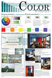
My partner, Megan Pharmer, and I researched on Color. In order to have a successful design we must understand the basic principles of color. It's not just about decorating a home but to create form through color. We need to realize how much color impacts us humans physically and mentally so that we can fulfill the needs of our client.
Two case studies were used as examples of how color works. The voyage home used light hues of blue and green because those colors are more relaxing for a vacation home. On the other hand, the comic book studio used very dark and dramatic colors. The darker the color the more energy it has.
Two case studies were used as examples of how color works. The voyage home used light hues of blue and green because those colors are more relaxing for a vacation home. On the other hand, the comic book studio used very dark and dramatic colors. The darker the color the more energy it has.
Subscribe to:
Posts (Atom)
